To push the level of our poster up I've changed a few things to improve it.
I've rotated the main background images so that the top of the goal is in line with the text. This also lines up the lines on the ground with the text below
I also adjusted the size of our actors names so they stand out more and moved them up the page slightly.
I also used colour correction on the back ground image to give it a slight blue/green tinge
Evaluation In what ways does your media product use develop or challenge forms and conventions of real media products? The Main task
By looking into other short film I can see I could see common traits that appear in short films, each of these film I looked at had some infulance in our final film.
One of the first short films I looked at was 'Perfection' directed and written by Karen Lin.
ECU of someone else
We never see anybody else in this film all the shots are close ups or medium close ups of her, the only
other people we see, we only see an extreme close up of part of there body of their back we never we their faces, This shows us that it's completely her story and every thing is completely focused on her. We never see her mums face but she appears a lot in this film, and it could be looked that the mum is applying the pressure for perfection, she starts her on the game when she's a baby. Late we see the mum correcting on thing or doing them for her, and then we will see her doing it herself.
Her Mum applying her lipstick for her
Her applying lipstick herself in a later shot.
A Sound Bridge is use to show the passing of time For example we see her finish practicing playing her violin, and start of hear a round of applause the next shot is then of clapping hands at her performance.
Clapping starts
We then see everyone clapping.
A lot of people can relate to this film it gives people an opportunity to look at their own life and see if they are always under the pressure of being perfect or living however they are happy. because of this I think the Audience for this film would be people in their
mid 20's - 30's.
This
A Comment on the film showing that people do relate to it
The themes of this film Could be seen to be simlar to our film. in this film the protagonist is making sure that she fits in and is accepted (mainly by her family) where the protagonist in Who are ya wants to be different untill she changes to try and fit in for her date.
I then looked at a short film called I ship it directed by Yulin Kuang. I ship it is a slightly longer short film than otherbut has lots of different camera and post production effects.
One of the characters YouTube video.
A number of time in the film it is filmed in the style of a YouTube video or a 'Vlogging' video this gives a different feel to the film as it seams the main characters are talking to the audience and inculding the audience in the story.
As this film has a lot of technology evolved in the plot the film makers had to find a interesting way to show the whats on the screen with out breaking the action. this is very important in the scene in the garage when a different conversation is going on while she receiving messages. To resolve this the messages appear on scene
Phone screen lets the audience know what the characters see.
Text messages on screen.
Spilt screen is also used a lot, this is a geat way to show more than one character in things like phone conversation e.c.t.
The uses of text on screan was very infuential in our short film our plot would not work very well with out it.
The Lonsome Footballer Directed By Elizabeth Mienert was very insfuential giving the us the idea to have a film based around football
We never see any of the characters in this film we only see there feet. It is almost all in POV and totally focused on the playing football.
In gernal Who are Ya? has traits that can be found in all of these films; Not many character, little diagloge, the use of technology on screne and a simple storyline but is also very different in some ways.
My Short Film
Our film looks at the some stereotypes and issues within modern society. It looks a lot of the pressure of women to look 'normal' and fit in with the latest fashion.
We've lots of camera techniques within our film to help make it interesting and portray our message. For example whilst walking through the corridors at college we use a POV shot. This allows the audience to be the main character and see what they're seeing, which was important for this scene as we have everyone looking at the camera, this gives the audience a chance to empashise with the main character......... To establish new locations on a number of occasions we used an ELS to give the audience a sense of where it is set. As we wanted the audience not to know some thing in our film so our ending could work it was important for them to know the locations. To make sure these scenes weren't completely dull we often used them to show a text conversation between two characters. The most conman shot in our film was a MCU this allowed us to show the protagonist reactions to events but still show some surrounding.
POV Shot.
ELS showing a new location.
Camera being used as a mirror.
Camera set up for this shot.
During the scene with the make up we decided to place the camera in front of the our character making it look like the audience is inside the mirror. This means the audience can see everything that is happening, makes it more interesting and we didn't have to film at the mirror and risk getting the camera in the reflection of the mirror or any other unwanted filming equipment.
A lot of our film was created in post production including our titel in clueded. It showes our protagonist runnning across the screen and the titel appearing after them. We also edited in messages to pop up on the screen when she resives a text we had to find a interesting way to show the whats on the screen with out breaking the actionand I felt that this was the best way.
Alarm to show that it is now the morining
Within our film we used a lot of post production and editing to show the changing of time. We used this very simply near the beginning of our the film, we had the sound of an alarm clock going off and the time flashing on screen showing that it is a new day and our character is about to wake up. We also used post production effects to show that our character trains ever day, as she does her practice her clothing changes to show the passing of time.
Shots fade and for a we see both images
Practices continues in a different top.
This scene was intial inspired by the training mantarge form the
Rocky film. Althought the final product is very different to this scene
from Rocky 3 I was looking for an intrsesting way to show practice
football and if we wanted our film to be longer
this part would have turned out like this but as we where limited for time we decided to keep it on the one drill.
The sound in our film was very important as there is no dialoge so the backgroung noise needes to sound right. In the scene where our protagonist is getting changed we use a Diegetic sound track. The sound is actually Non-Diegetic but as we show a clip of the protagonist turning on the music it makes it Diegetic (meaning we can use a copy righted song)
Looking a narative in our film we're going to have a linear structure to our film
Bordwell and Thompson
Story-Goes to football training every day, goes to school,
Starts to get bullied, continues playing football more bullying more
texting e.c.t. Goes back to her house gets
ready to go out, meets up with guy and has dinner.
Plot -Playes football, Goes to college, Ignores the bullies, gets changed, meet guy out side the cafe.
Todorov
Equilibrium - Her playing football and going about her normal life.
Disruption - Starts messaging the guy
Confrontation - The girls at her school find her phone are see that she is messaging this other person.
Resolution - Meets up with friend, get a make over to go out.
New Equilibrium - Meets up with her date
Barthes- Enigma codes
Enigma codes - There is one big enigma code, with don't know the gender
of the person she's texting Although it is
slightly suggesting that he is a girl, there is still a lot of mystery
about it.
Propp
Hero: Emma
Villain: The other girls at her school
Donor: The friend the she meets at the cafe (Clara)
Dispatcher: The friend the she meets at the cafe (Clara)
Helper:
'Princess':Her date
Her father: Her date
Ancillary task One - Film Poster
All the film poster I looked at were very simple. For example...
In the poster for Dancing in the Ashes The low key lighting and the colouring in this poster gives the audience the impression that it is going to be a thriller/ mystery film. The main image on the poster doesn't reveal much about the characters (as we don't see any of there faces) but it does tells us that this film is or has some aspect of ballet in it.
Unlike most posters is poster does not have any reviews on it. This is unusual as the audience can not know what people think of the film. Again no names of actors appear on the poster the only text we see is the title 'Dancing in the ashes' which is place in the center of the poster on top of the image. The lack of information on this poster does help bring across a feel of mystery.
And in the poster for The Blue DressThis is a very simple poster. It only contains 2 colours, this make the images and the text stand out on the white background. Unlike most posters the is no photo. Instead there is 4 different silhouette, again these make the poster look bold and stand out. The images do not tell us much about the story and we do not get to see any of the character. The title of the film is right in the middle of the poster. It is all in capitals, and the colouring make it look like these words have been pushed or cut out of the dress. The actors names are also in the middle of the poster either side of title, they are in the same fount, slightly smaller. Overall the poster doesn't give way much of the what the film is about, but the colouring or the style of the poster give it suggest that it is most likely to be a comedy or a romance style film.
Both of these posters are very simple we wanted to keep with this for our film poster. I found it very hard to find a short film poster that was a simliar genre to our film so I started looking at full length movies to see how football film posters are layed out and how I can use this in my poster.
The Poster for the film Believe Is very similar to our final product, with a Football pitch in the background and a title in the center of the screen the only difference is that ours doesn't have the protagonist in the photo.
Gracie is the closest thing I've found to our film it's based on real events about a girl who playes football and the social exceptance of it. The poster Is a full sized photo of the protagonist. the backgroud is a photo of the sky which could represent something to do with reaching for your deams or goals.
For our film poster I want to keep with as many of the convention with in the football films as possible but also stay slightly away from them thats why our film doesn't have a photo of the protagonist in it
Our Final Poster
During the process of creating the poster we had a number of different designs that we could of used. This was our original design for the poster that we were going to uses....
But unfortunate problems with the background photo meant that we couldn't use it, so as
we had to change the photo we decided to use a picture of a local football
ground instead of a big stadium.This
makes it more relatable to our film as our protagonist is more likely to play
on a pitch like this.
One of the key points on our final poster is the fount of
the main title which is different to all the other founts on the page. The
fount is supposed to look like the floodlights that you get at a football
stadium as it was important for us to stick with this theme.
The one main thing that is different form our film poster
and the football film posters I’ve already looked at is that ours does not
feature a main protagonist on the front. Our original ideas did feature a main protagonist but was not used. the negative side of not having this on our poster is that it only shows us one side of the story saying nothing about it involving female footballers or issues to do with bullying, so may appeal to the wrong target audience.
Two of the original ideas for film poster with the main protagonist on the front which were decided not to be taken any further.
Ancillary task Two - LWL
All the of the reviews in little white lies are set out in a very
particular way, It applies to all of there reviews and we're going to
want to keep to theses conventions in our review.
Key points in the layout of LWL
Photo - All reviews have a stills from the film as a photo at the
top of the page. It's important that this photo is an equal length away
from the left right and top.
Title in size 36 Century Gothic
Box with information on the film; directed by, staring and release date.
Text - The main body of text is size 12 written in Aparajit, with the first letter dropping down 3 lines
Reviews written side ways on the out side of the page.in font Microsoft YaHei
Review 'Box' in the corner of the page giving the film a rating out
of 5 on three different things Anticipation, enjoyment and in
retrospect. Each of these aspects also have a shot comment on the film.
Page Number- The page number at the bottom of the page is always 3 digits e.g 001 or 023
Our final reviews lay out fits in with all of the conventions above.
How effective is the combination of your main product and you ancillary task?
In these video i'm going to look at the combination of my Short film poster and review. (It's in 3 parts as my camera would only recored to a short amout of time.
What have you learned from your target audience feedback?
Our target
audience was teenagers aged around16-21 espeshally girls who are heverlyinvolved in sport (mainly football) Our film appeals will to this audience because some part would be very relatable to them.
When we where
creating the intial idea for our I sent out a Messages explaining the outline of our film and asking for peoples thoughts on it. I made sure that I sent the messages to people in our target group so we get the correct feedback. Overall the feedback was really positive, there was some comments
weren't that useful in telling us what was good or how to improve it.
So next time I get audience feed back I need to ask specific questions
to the the correct type of answers. A key thing that they like was the
twist at the end.
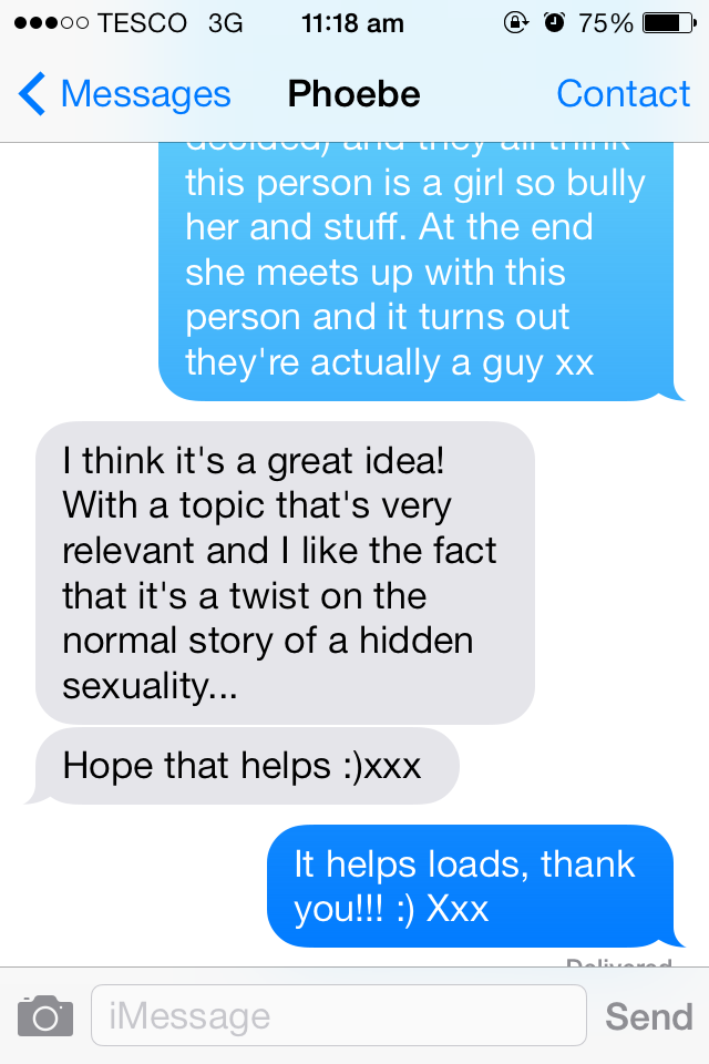
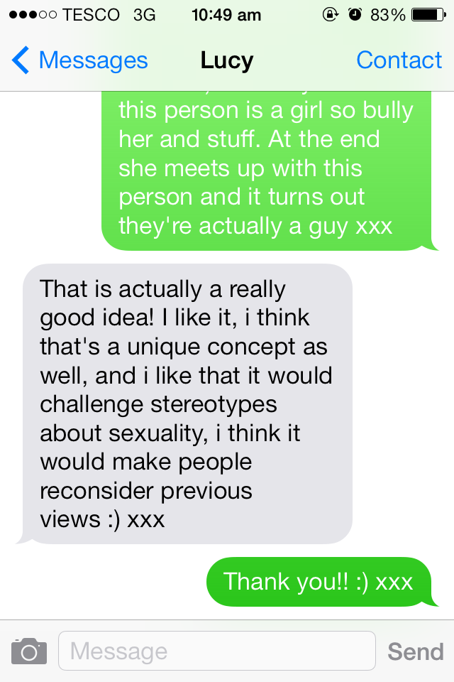
Heres 3 examples of the feedback I got for our intial idea
Once our film was finished I asked again what people thought, to see what i'd change if I had a chance to improve it in the future. I didn't ask as many people as I did with my intital idea as I wanted my feedback to be more detailed so I had to as further questions. Here's an exaple of one of the convosations I had
Oveall they thought the film was good but most people felt there wasn't enough bullying and not enough emphasis that they think she is a lesbion so the ending doesn't have an as great effect. I agree with this I think all we needed to do was add one scene where being bullied in person to show this. Other feedback I got was that there wasn't enough football, it was said that after the first bit it seamed like the football was forgotten about.
To get feedback on the Poster I posted it on tumblr and a explained the film to see what people thought of it. The genral response was that it was too football heavy and doesn't show the side of the film that looks at sterotypes they said it just looked like a normal football film.
One of the responses I got on Tumblr
Due to problems with the photo in our poster we had to change parts of it. I then posted this one on tumblr to see the response and to have the two compared
How did you use new media technologies in the construction, and research, planning and evaluation stages?


.PNG)