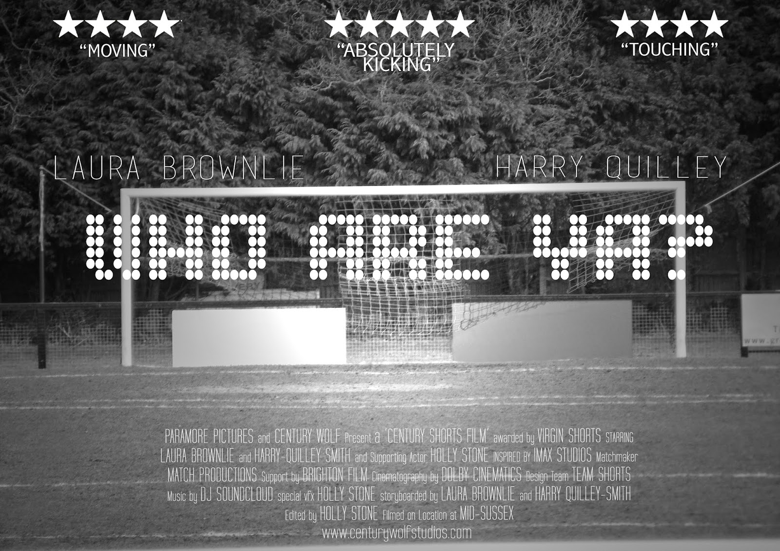
Final Poster Editing
While editing our final poster, I decided to create many designs and ask not only my group, but also my peers for which one they favoured the most and which was more effective, below is each designed followed by an explanation into what it does/doesn't achieved:
 |
| First Design: Above is the first design I created. I removed the initial advertisements which were on the boards behind the goal. The filter added to the image was favoured in the fact that it makes the poster appear more severe, and the angle of the shot makes the poster shout the theme out towards the audience. The theme of course , football, is spoken through the title of our short film and the image seen in the background of a goal. However, I recieved critisism on the boards being left blank, they appear to reveal a perfect opportunity to include awards etc from film companies and festivals, therefore my next design I opportunity to change this. |


No comments:
Post a Comment